Reporting in Orbit
The Campaigns Overview in Orbit provides a comprehensive dashboard showing campaign activity, from PeopleStage.
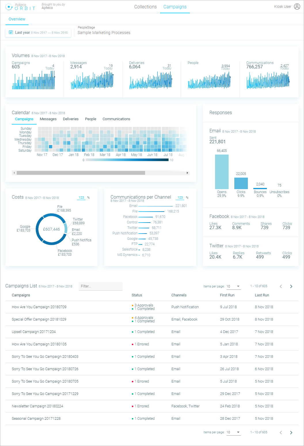
By default, the data is shown for a whole year, but you can filter this down to various fixed time periods.
The overview screen refreshes every few minutes to get updated data.
Volume sparklines
Volume sparklines show the number of campaigns, messages & deliveries per day, plus the number of communications & deduped people.

Calendar view
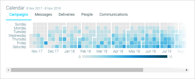
Calendar view shows the same figures as those displayed by the sparklines but in a calendar style grid.
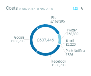
Costs torus chart
This chart shows the proportion of costs per channel type over the time period.
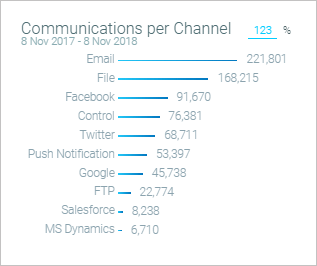
Communications per channel bar
This chart shows the number of communications per channel type over the time period.
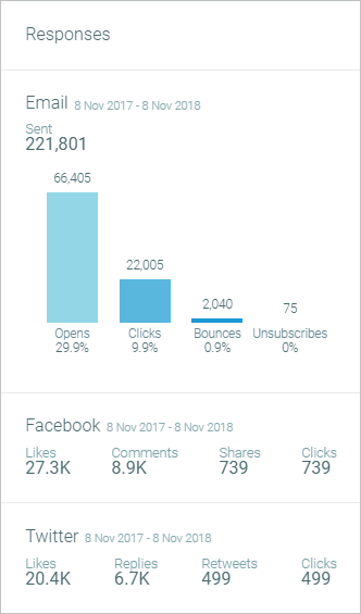
Responses chart
The Response Chart shows the number of different broadcast responses & the number of Facebook & Twitter responses.
Campaign list
The Campaign List shows each campaign in the diagram, current status, & additional information about the number of campaigns, deliveries communications & channels.
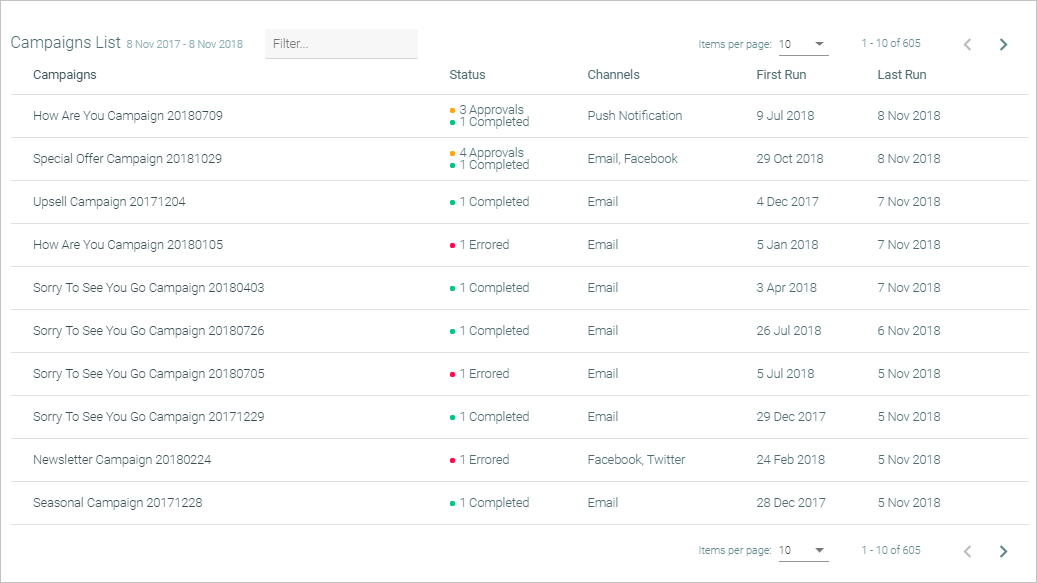
You can filter the list by entering keywords into the Filter box.