Custom thematic labels
When you apply custom colours to a shaded map, you can also set up corresponding custom labels for each of the bands in your thematic shading.
By default, when you create your user defined banding and apply custom colours, the map legend displays the range values:
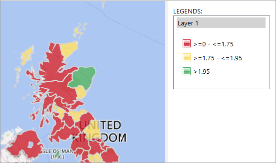
Having the ability to create custom labels which are then visible in the map legend can help to provide further meaning to user defined colours.
To add custom thematic labels:
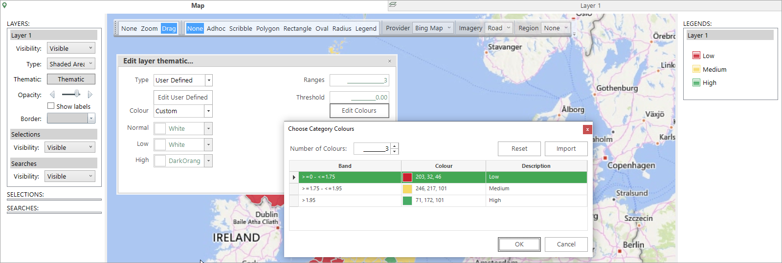
- Navigate to the map's Thematic -> Edit layer thematic -> Choose Category Colours dialogue.
-
Add the required labels into the Description column and OK to update the legend.
Custom colours
There are many ways to apply thematic shading to a FastStats map, helping you to more easily visualise the distribution of records and quickly interpret numeric results. Typically you specify a 'low', 'high' and 'normal' colour and this generates a graduated scale according to the defined bands.
Sometimes, however, you may not want a graduated colour scale and, instead, a non-thematic, 'custom colour' solution is required. Let's take a look at some examples.
Example
Create a shaded map to display the average number of bookings by postal area. Use custom colours to indicate whether the average number of bookings in each area is considered to be 'bad', 'okay', or 'good'.
- Open a new Map from the FastStats Toolbox.
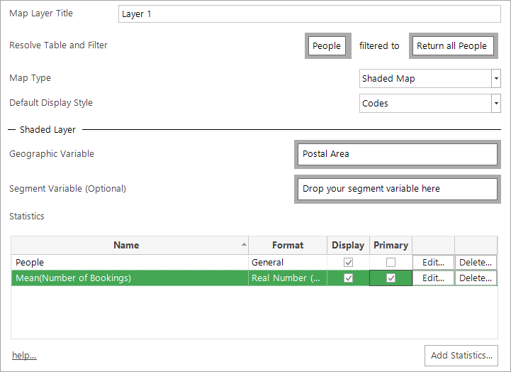
- In the Layer 1 tab, drag and drop Postal Area onto the Geographic Variable drop-box.
- Right drag and drop the Number of Bookings variable into the Statistics panel and select Mean.
-
Set Mean(Number of Bookings) as the primary statistic.
-
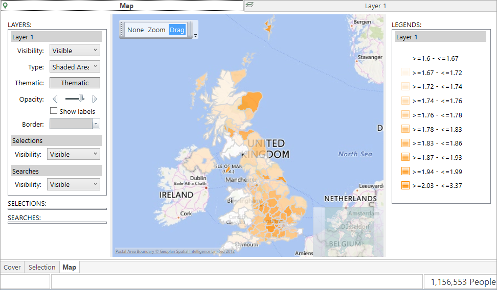
Build the map.
-
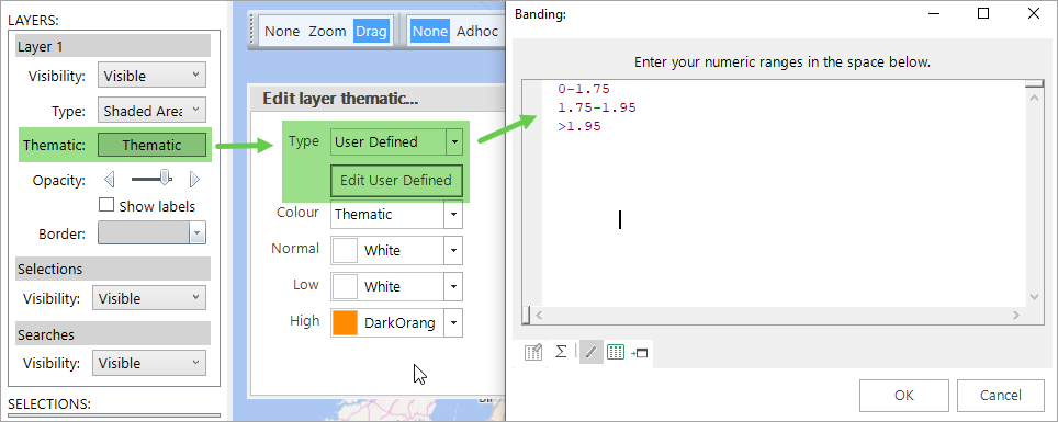
In the Map tab, open the Thematic dialogue and set the Type to User Defined, then Edit User Defined and enter the following bands:
0-1.75
1.75-1.95
>1.95
-
Return to the Thematic dialogue, from the Colour drop-down select Custom and then Edit Colours.
- In the Choose Category Colours dialogue set the number of bands to 3 and then click on the drop-down next to each banding to select the colours: red for bad, yellow for okay, and green for good.
-
Click OK to complete the process and view the map:
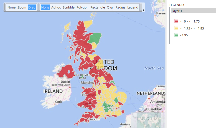
With the use of non-thematic colours, you can clearly see that postal areas with a lower average number of bookings, shown in red, generally tend to be away from highly populated spots. Aside from a couple of outliers, green areas are primarily in and around London. Yellow areas make up the middle ground.