Thematic shading
Thematic shading is a visualisation technique used to highlight the numeric distribution within the Cube result. Thematic shading allows easy and quick interpretation of cube results. You can control the range of colours used and the method of assigning cell colours based on one of the numeric results.
The default thematic shading option is set to Quantiles with 10 ranges i.e. deciles.
To change the settings for the thematic shading click the  icon to bring up the following menu.
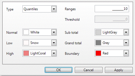
Thematic type
Cells can be shaded in the following ways:
- Equal Ranges – each colour is assigned an equal size, consecutive numeric range calculated as the difference between the lowest and highest cell, divided by the number of ranges
- Mean Split – fixed to two ranges with one colour below the average and one above the average
- Quantiles - each colour is comprised of approximately the same number of cells with shading applied from low values to high values
- Geometric Ranges - creates ranges with increasing widths
- Top N – highlights the top N cells. All other cells are coloured using the normal background colour
- Bottom N - highlights the bottom N cells. All other cells are coloured using the normal background colour
- Standard Deviation – expresses by how much the members of a group differ from the mean value for that group
- Threshold – above and below a particular value specified in the Threshold setting, fixed to use two colour ranges: one above the threshold and one equal to or below the threshold
- Absolute Threshold – fixed to use three colour ranges: one below the negative threshold value, one between the negative and positive threshold values and one above the positive threshold value
- User Defined - create and apply your own numeric bandings
Two-way threshold options
There are further options available that allow for a two-way threshold to highlight values above and below a threshold or absolute threshold value. These thematic colouring options are intended for use with values such as a Z-score, where values can span both the positive and negative and use three colours (low, central and high) to create the two colour ranges.
The low colour range will be used from the most negative value to the negative threshold; the central ("normal") colour will be used between the negative and positive threshold; the high colour range will be used between the positive threshold and the most positive value:
.png "Illustration of 4 negative value bands in blue, a single central band in white, and 4 high value bands in red")
The options are:
- Equal Ranges From Threshold
- Quantiles From Threshold
- Equal Ranges from Absolute Threshold
- Quantiles from Absolute Threshold
Example 1
The example below illustrates the Equal Ranges From Threshold option using the Holidays data set.
- Create a Cube that displays Income by Gender at the People table level, restricted to Male and Female in the underlying Selection.
-
Use the
.png) dialog to add the Index statistic to the cube display:
dialog to add the Index statistic to the cube display:.png)
-
Set Index as the Primary statistic:
.png)
-
Select Equal Ranges From Threshold as the thematic type and set the Threshold value to 100.
-
Change the colours used for the shading to something appropriate — e.g. Low = blue and High = red.
.png)
-
Click OK to see the results:
.png)
Based on the Index statistic, with a threshold value of 100, the coloured highlighting within the cube quickly provides the insight that — on the Holidays system — there are a lower than expected number of females on high incomes.
Example 2
In the Equal Ranges From Absolute Threshold example below, the Cube will be shaded on the Zd Exp statistic with a threshold value of 3.
- Create a Cube that displays Income by Gender at the People table level.
-
Add the Zd Exp statistic to the Cube display.
.png)
-
Set the Primary statistic to Zd Exp.
The Zd Exp is the "z-score of deviation from expected value", and is a significance measure which gives an indication of the size, direction and significance of any differences from the expected. Positive values are due to higher counts than expected and negative values due to lower counts than expected.
-
Select Equal Ranges From Absolute Threshold as the Thematic type.
- Set the Ranges to 10 and the Threshold to 3.
- Change the colours used for shading to something appropriate (as described in Example 1).
-
Click OK to see the results:
.png)
The Equal Ranges from Absolute Threshold in this example will create ranges which will be split into 10 each way from the threshold, with equal bands between the Threshold Minimum and the Threshold Maximum.
The colour highlighting on the Cube makes it easier to establish insight, such as being statistically confident that there are fewer than expected females of medium income, and more than expected high income customers with unknown gender.
Turn off thematic shading
To turn off thematic shading:
Choose ‘None’ from the Type listbox
.png)
Ranges
The Ranges option, within the Thematic dialog, lets you specify how many different shades to use when shading the Cube. The default setting is 10.
Thematic colours
To change the colours used for shading:
- Click on the relevant list-box option.
-
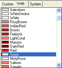
Specify a colour from either the Custom, Web or System tabs.
You can change the following colour settings:
- Normal is the default colour for a particular cell.
- Low is the shade used for the lowest value cells.
- High is the shade used for the highest value cells.
- Sub Total is the shade for the subtotal column and row.
- Grand Total is the shade for the grand total cell.
- Boundary is the colour used for either the boundary of the entire cube, or for the nested segments if there are multiple variables on either axis.
Custom colours
There are many ways to apply thematic shading to a FastStats cube, helping you to more easily visualise the distribution of records and quickly interpret numeric results. Typically you specify a 'low', 'high' and 'normal' colour and this generates a graduated scale according to the defined bands.
Sometimes, however, you may not want a graduated colour scale and, instead, a non-thematic, 'custom colour' solution is required. Let's take a look at some examples.
Example
Create a cube which displays the average profit per booking for each Holidays Company Plc store manager, broken down by holiday product. Use custom colours to indicate if the average profit for each manager/product is below, on or above target.
- Create a new Cube from the FastStats Toolbox and add Manager and Product as dimensions.
- Right drag the Profit variable into the middle of the cube as a measure and select Mean(Profit).
-
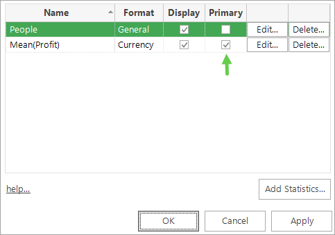
Open the Statistics dialogue and make Mean(Profit) the primary measure.
-
Build the cube.
- Click
 to open the Thematic dialogue and from the Type drop-down select User Defined then Edit User Defined.
 -
Enter the following bandings and then click OK:
0-50
50-100
>100
-
Return to the Thematic dialogue and from the Colour drop-down select Custom and then Edit Colours.
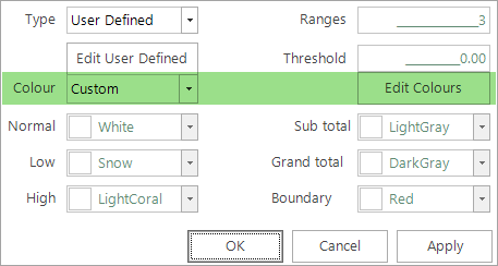
-
In the Choose Category Colours dialogue set the number of bands to 3 and then click on the drop-down next to each banding to select the colour.
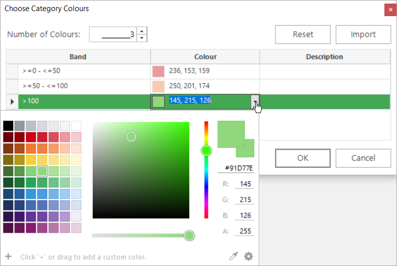
-
Click OK then Apply and OK — the cube display updates to reflect your defined settings.
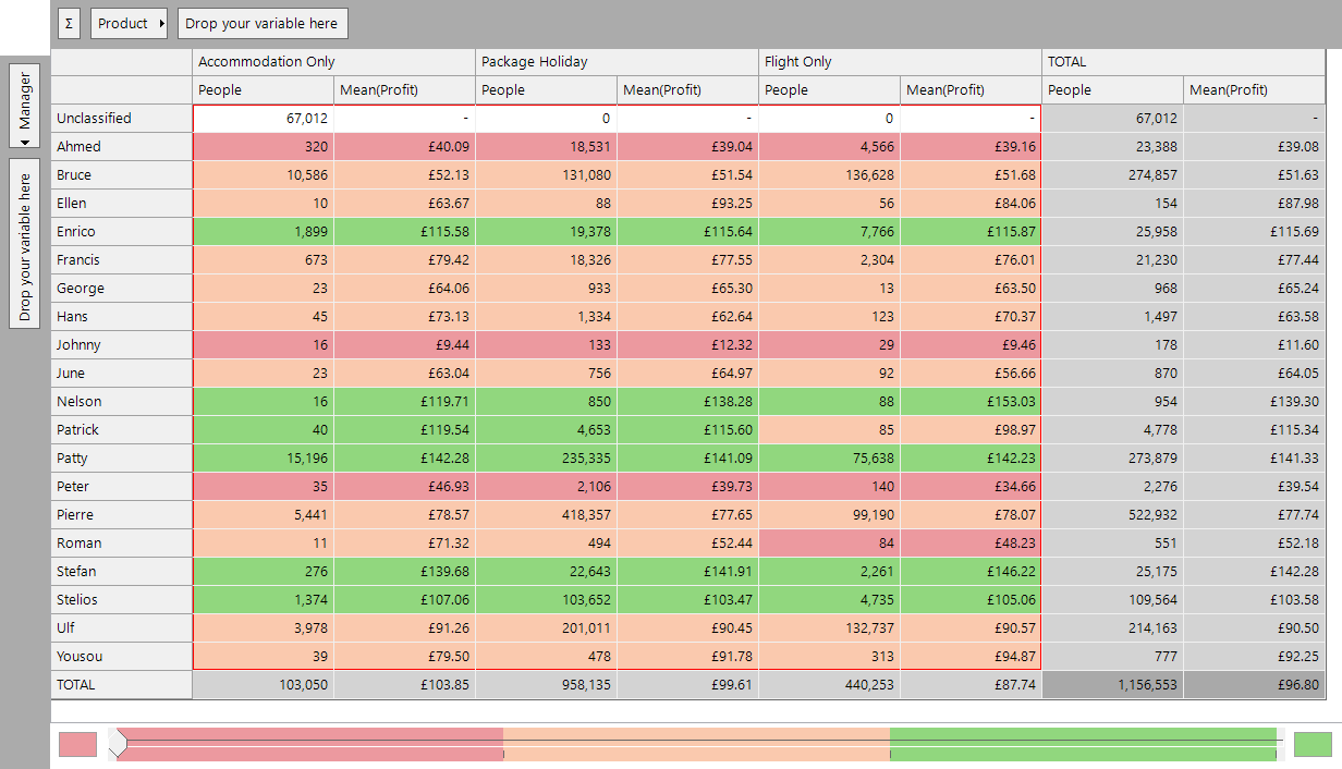
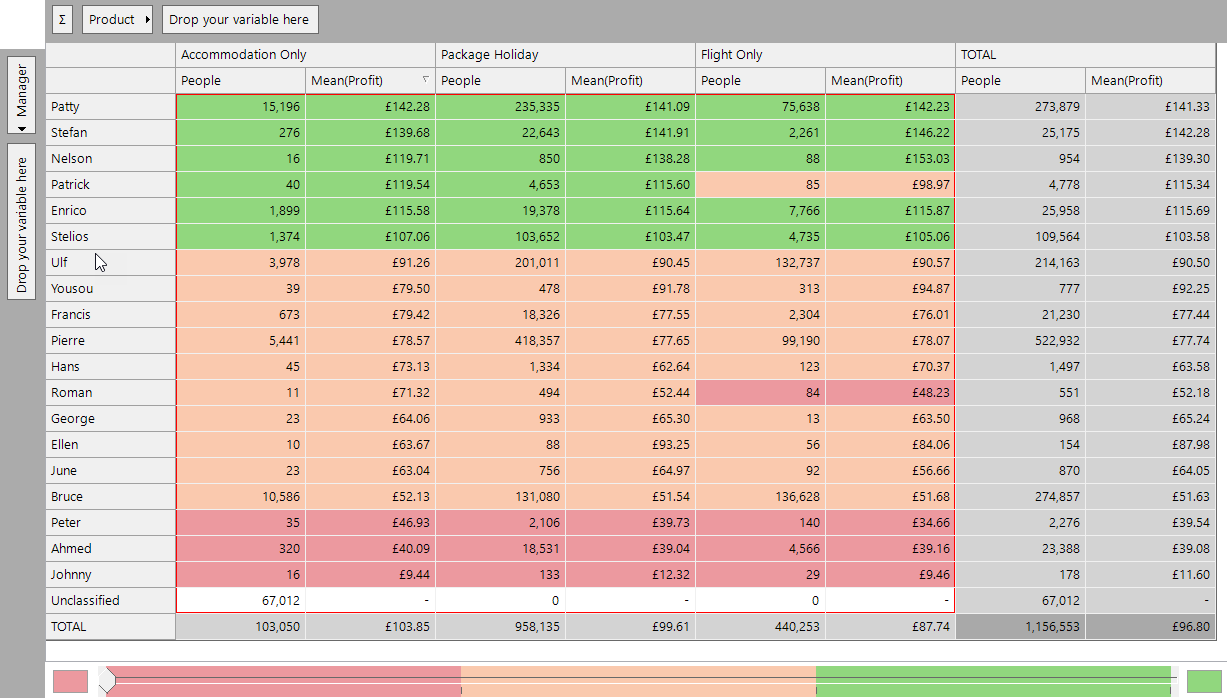
At a glance, the custom colours allow you to see that Ahmed, Johnny and Peter appear to have some work to do whilst, in the main, all others are on or above target.
-
Sort into ascending or descending order by Mean(Profit) for an even clearer display: