Behavioural modelling - interpretation of charts
There are a variety of chart types available for you to use:
- Percentages chart
- Counts chart
- Analysis rate chart
- Index chart
- Z-score chart
- PWE chart
- Insight types
- PWE v Coverage chart
- Insight PWE v Coverage chart
- Insight PWE v Mean PWE chart
- Power chart
- Insight PWE v Power chart
- PWE Agreement chart
Percentages chart
Purpose
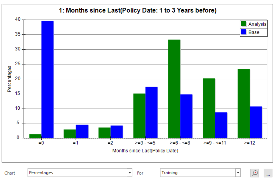
This chart gives the percentage of Analysis and/or Base records in each range. It highlights the difference between the two groups in each category.
Terminology
Percentage - the proportion of records in a category.
Interpretation
The zero range represents the current month. Almost 40% of the base group are in the zero range whilst 1% of all Analysis records are in the zero range. This suggests if someone has recently purchased a policy they are unlikely to do so again.
Counts chart
Purpose
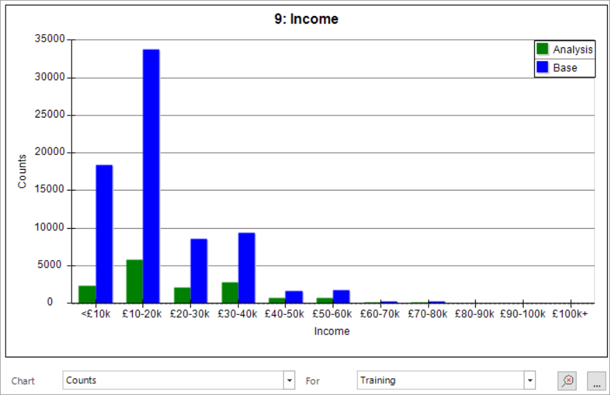
To see the volumes of records in the analysis and/or base groups.
Interpretation
The longer the bar the more records in that category.
This provides and indication of how many people you could be marketing to based on a particular category.
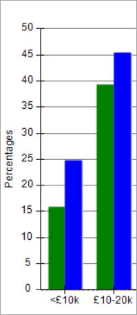
Be careful of drawing conclusions about likelihood from this view. Looking at the £10-20k range there are approximately 6000 analysis records and 34,000 base records. It is possible that those 6000 analysis records may make up a higher proportion of the analysis group than the 36,000 base records make up of the base group. If you looking at the display in the percentages chart , it shows that, as a percentage of each group, the figures are more similar than their counts would suggest.
Analysis rate chart
Purpose
This chart identifies the proportion of analysis records in each category.
Terminology
Analysis Rate - the proportion of a category which is in the analysis selection.
Interpretation
The higher the bar, the more likely people in that category are to display the desired behaviour. The red line shows the proportion of the base group in the analysis section. Therefore, when a bar is higher than the red line, that category is predictive of being in the analysis group.
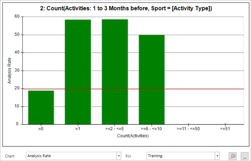
In this case you can see that, if people have not booked a Sports activity, they are less likely to fall in the analysis group than if they had. Only 20% of those with no sports activity are in the analysis group, whilst almost 60 % of those with 1-5 Sports activities are in the analysis group.
Index chart
Purpose
How likely is membership of a category to being in the Analysis group.
Terminology
Index – the index is centred around 100 and shows the relationship between two figures, in this case the analysis and base percentage in each category.
Analysis percentage/Base percentage * 100.
Interpretation
A figure over 100 suggests people in that category are likely to be in the analysis group compared to those in the base group.
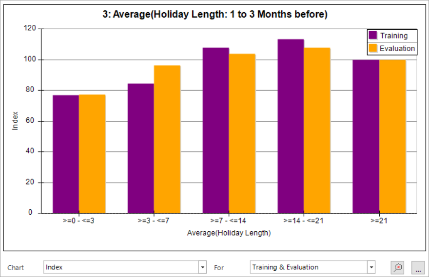
In this example, individuals who have an average holiday length of between 7 and 21 days are more likely to be in the analysis group. Those with an average holiday length of 21 days or more have an equal chance of being in either the analysis or base groups, while individuals with shorter holidays are less likely to be in the analysis group.
Z-score chart
Purpose
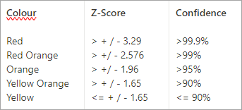
Can you trust the results presented? You can view this chart independently but all relevant charts are shaded in line with the table below to help draw conclusions.
Terminology
Z-Score – a figure which is the standardised measure of how confident you can be that the result presented is a true characteristic of the data and not a quirk of the data sample used. The further from 0 the more significant the results.
Interpretation
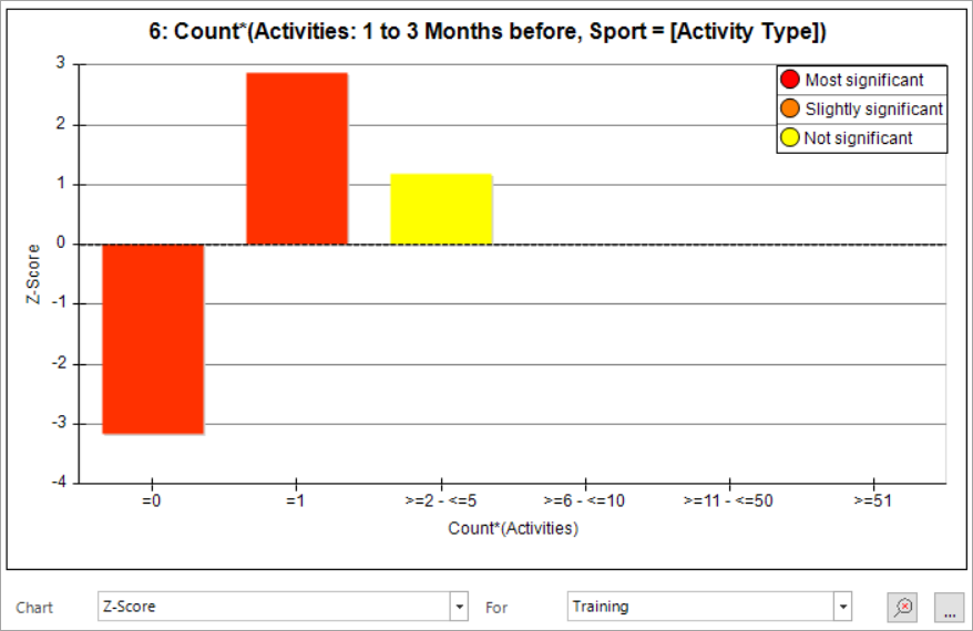
From the chart above, whatever conclusion you may draw regarding those in the 2-5 activities range should be considered carefully as the bar is shaded yellow, indicating that the Z-score suggests you can be less than 90% confident in the results.
Related charts
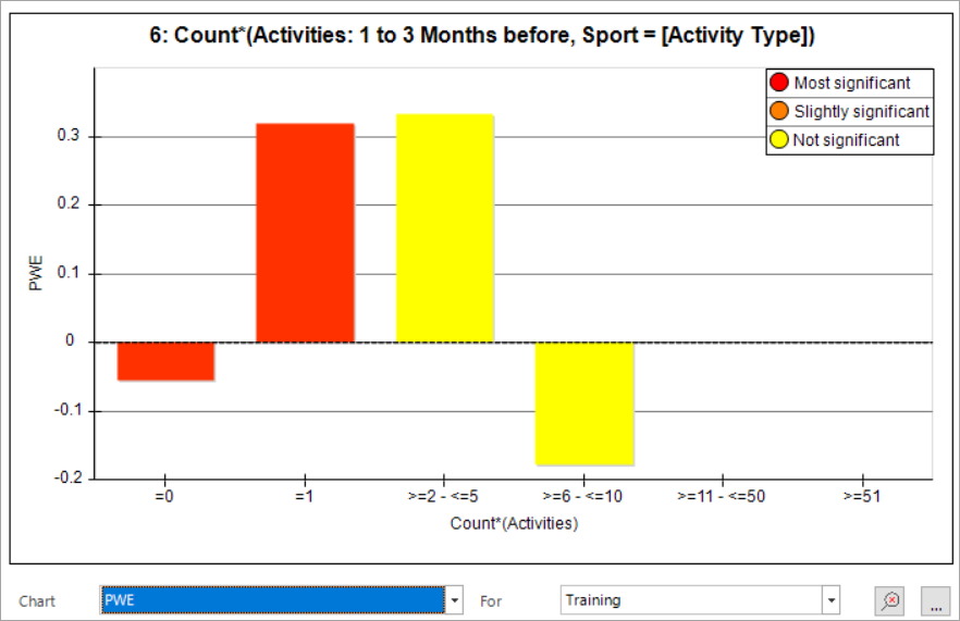
Whenever it is relevant, other charts are colour-coded according to the Z-score. This is often an easier way to assess the implications of the Z-score. See below:
PWE chart
Purpose
Identify if membership of a category makes a record more or less likely to be in the analysis group.
Terminology
PWE – Predictive Weight of Evidence. Does membership of a category make a person more or less likely to be in the Analysis group? The evidence is calculated by considering the information gain on learning the classification of a record is in this particular category. The evidence algorithm is derived using information theory and probability.
Interpretation
The higher the PWE the more likely membership of that category means a record will be in the analysis group.
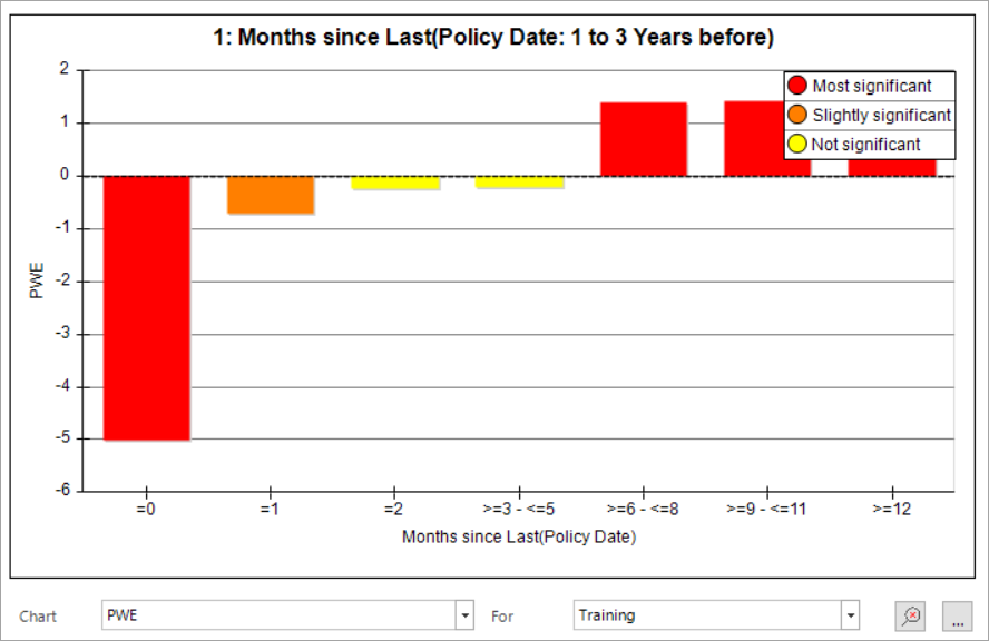
In the example above, PWE increases as time since last Policy passes and meaning that the longer ago a person purchased their last policy, the more likely they are to fall into the analysis group, with 6 months being the point people tip from not likely to likely.
Insight types
Behavioural features (dimensions) are assigned one of 4 insight types:
- Positive features - where the insight categories predominantly have a positive PWE.
- Negative features - where the insight categories predominantly have a negative PWE.
- Balanced features - where the insight categories provide a balance of positive and negative insight.
- No Insight - where there are no categories with a significant or sizeable PWE.
The above definitions use an 80:20 cut-off to categorise dimensions – i.e. if the balance of positive/negative insight categories is less extreme than 80:20 based on coverage, the feature is classed as balanced.
Points on charts can be coloured in a variety of ways. It is often useful to colour by insight type. To choose how the chart is coloured:
-
Click and interact with the Colour by drop-down options:
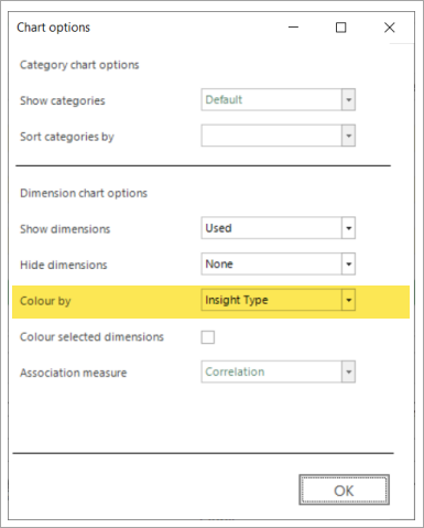
The dimension list view, below, shows some dimensions that may be discounted if the insight measure is not considered.
- Insight Coverage shows us the percentage of records that can be given a sizeable and significant PWE score.
-
Insight PWE indicates how predictive just the records where a prediction can be made are.
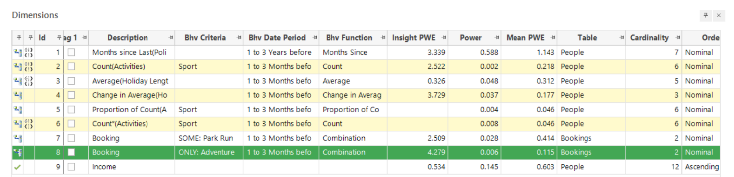
The highlighted row represents Bookings with ONLY: Adventure Sports activities and demonstrates the importance of Insight PWE. Looking solely at Mean PWE, you might discount this dimension as it is impacted by the large number of records without this transactional behaviour (as some of the following charts will show). However, looking at the Insight PWE, it is clear that it could be very useful to use this dimension in a model.
PWE v Coverage chart
Purpose
There will always be people to whom the behavioural feature does not apply. For example, a behavioural feature looking at Months since Last Policy Date would not apply to those who have never had a policy. This chart allows you to see the PWE scores for a category, together with the number of base records covered.
Terminology
Coverage – the number of base records included in that category.
Insight PWE – a weighted average of positive and negative PWEs where the rating is based on the base count. Essentially, this is the Mean PWE of only the sizeable and significant categories in a dimension (Insight Categories).
Insight Coverage - how many records can be given a sizeable and significant PWE score. It is the percentage of records in the base that are predictive.
Note
The chart colours are consistent and can be interpreted in the same way across all charts.
Interpretation
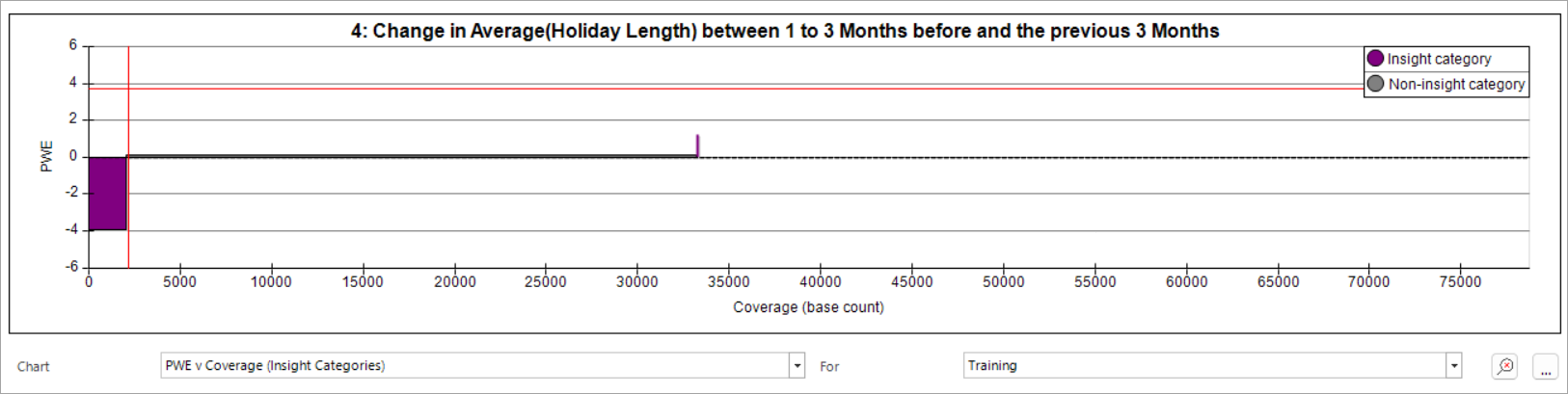
- The length of the bar from the 0 axis indicates the PWE for that category; the width is representative of the number of base records falling into that category.
- The scale is consistent across the charts of all features and is based on the total number of people in the base selection on the training or evaluation date. In this example, the majority of people are not scored as they have not taken out an insurance policy.
-
The horizontal red line indicates the Insight PWE, and the vertical red line represents the Insight Coverage. Hovering over the red line displays a tooltip which, in this example, indicates that the Insight Coverage is 2,174 of the base count and these people offer great predictive power - Insight PWE 3.73. Such a small amount of people could easily be missed if only the PWE of the dimension is studied.
Insight PWE v Coverage chart
Purpose
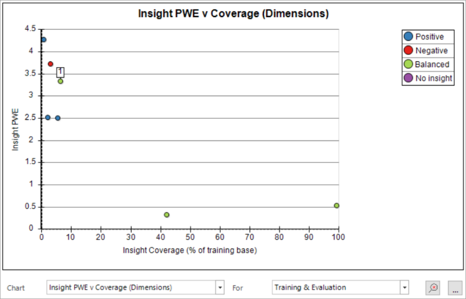
The PWE v Coverage (Categories) chart demonstrates how niche categories can be very predictive, but only apply to a few records, whereas the Insight PWE v Coverage (Dimensions) chart shows the relationship between Insight PWE and the records covered for each dimension.
Terminology
Coverage (Dimensions) – the number of base records included in that dimension.
Insight PWE – a weighted average of positive and negative PWEs where the rating is based on the base count. Essentially, this is the Mean PWE of only the sizeable and significant categories in a dimension (Insight Categories).
Interpretation
Unlike the previous charts, Insight PWE v Coverage (Dimensions) is a single chart rather than a separate chart for each dimension. Instead, this chart has a point for each dimension.
With this chart, it is common to see that, as the Insight PWE value increases, the Insight Coverage value decreases. To identify a particular point, hover your cursor over it and/or click the dimension in the variable panel.
In this example, Months since last Policy Date has been selected. It has an insight PWE of over 3.34 which indicates that it is predictive, but only covers approximately 6.26% of the evaluation's base selection. The fact that it is green tells us the insight is both positive and negative i.e balanced.
The bottom-right two points represent Change in Average Holiday Length and Income. They cover a far greater percentage of the base group but are not nearly as predictive.
Insight PWE v Mean PWE chart
Purpose
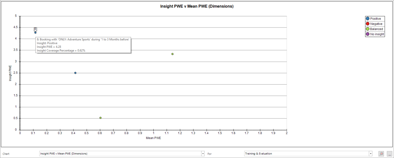
This chart is a clearer way of identifying which dimensions are offering the best predictive power by comparing Mean PWE with Insight PWE. The chart offers a more visual way of drawing conclusions than using the dimension list view.
Terminology
Mean PWE – the average predictive strength across all categories in a dimension.
Insight PWE – the Mean PWE of only the sizeable and significant categories in a dimension (Insight Categories).
Interpretation
Point 8 in the chart above refers to those with ONLY:Adventure Sports. It has a very low Mean PWE because the measure relates to all records. However, when looking at just the records with ONLY:Adventure Sports bookings (0.62%), we are presented with an Insight PWE of 4.28. This dimension may have been discarded if looking just at Mean PWE, but the Insight PWE suggests it is a useful predictor. You may want to pay particular attention to points towards the left of this chart.
Power chart
Purpose
The Power metric will be familiar to existing FastStats Modelling users. Power works very well when assessing models with a variety of dimensions, because multiple dimensions are likely to contribute different insight. Using the Power metric on a single dimension only works well if that dimension can cover a wide range of customers. The Power chart allows us to see the effectiveness of a dimension when its categories are ordered from most predictive to least predictive.
Terminology
Power – how well a model/dimension differentiates good and bad prospects.
Interpretation
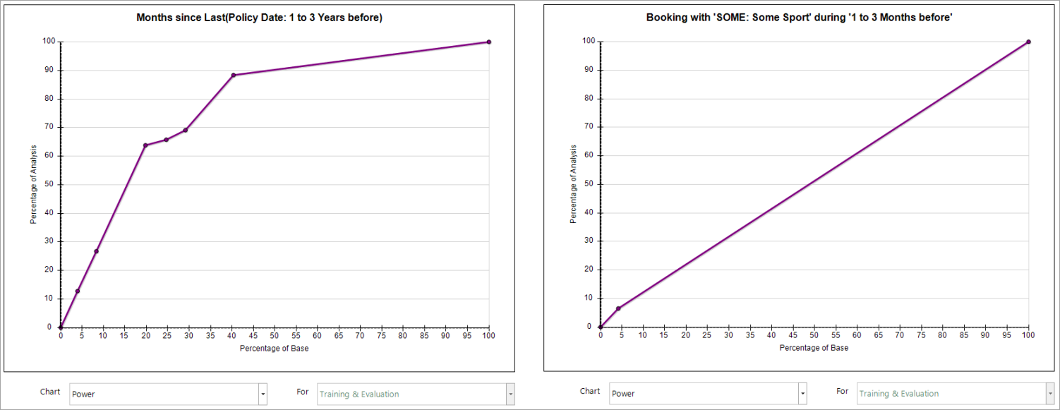
- The horizontal axis represents the percentage of those scored by the feature, not the percentage of the entire base. Hovering over a point displays a tool-tip that indicates the category to which it relates.
- The more records scored, and the more predictive categories are, the more the line curves away from being a straight, diagonal line. Ideally, the dimensions have a pronounced curve. If the curve is close to the diagonal, it suggests the dimension as a whole may not be ideal but the Insight PWE might counter this argument and suggest that some of the categories are very predictive.
- The categories are ordered from most predictive to least predictive.
- In the first chart above, you can see that the top 3 categories result in a steep gradient before the curve becomes more shallow. This suggests that those 3 categories are powerful in predicting the likelihood of someone being in the analysis group.
- In the second chart, the line is almost diagonal. This is mainly because there are only two categories available - either a person has some sport activity, or they do not. Initially there is a rise in the power with about 4% of the base identifying approximately 8% of the analysis. The only other point falls at the 100% point on both axes, resulting in a straight line.
In short, this is a useful chart when dimensions have a number of categories covering a number of records, but not as useful when the dimension has fewer categories or covers fewer records.
Insight PWE v Power chart
Purpose
This chart helps to make the Power metric more relevant for dimensions of all types. The Insight PWE of each dimension is plotted against the Power for that dimension and allows you to interpret the value of a dimension by assessing how powerful it is in relation to the amount of PWE insight it offers.
Terminology
Power – how well a model/dimension differentiates good and bad prospects.
Insight PWE – a weighted average of positive and negative PWEs where the weighting is based on the base count.
Interpretation
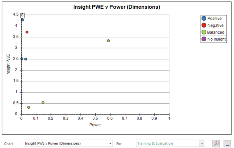
- Each point on the chart represents a dimension and hovering over the point gives a tool-tip that identifies that dimension.
- Point 8 on this chart represents bookings that are ONLY: Adventure Sports activities and the power for this dimension is very low. In fact, the dimension as a whole is not powerful due to there being very few people who only have these adventure sports activities.
However:
- The positive Insight PWE value indicates great predictive power – i.e., those few who have this transactional behaviour are very predictive.
- The point with the highest Power (0.6) and the highest Insight PWE (3.4) is another useful dimension (Months since Last Policy Date), whilst the points clustered in the bottom-left of the display represent the least useful dimensions in this example.
PWE Agreement chart
Purpose
This chart highlights differences in PWE between the evaluation and training periods. It visualises the number of records and informs on the significance of each category.
Terminology
Evaluation PWE – how predictive is each category on the evaluation date.
Training PWE – how predictive is each category on the training date.
Evaluation agrees – training and evaluation agree and the results are statistically significant.
Evaluation inconclusive – the category is not statistically significant in the evaluation period.
Evaluation disagrees – training and evaluation disagree and the results are statistically significant.
Training not significant – the results in the category are not statistically significant in the training period.
Non-insight category – no insight is gained from the category.
Interpretation
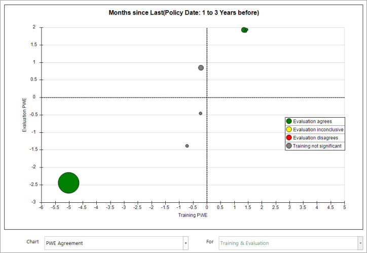
Ideally, the points in the chart will be arranged diagonally from bottom left to top right, indicating that the training and evaluation data agree on the categories which predict that someone is likely - or unlikely - to exhibit particular behaviours.
In this example, splitting the chart into four quarters indicates:
- Bottom-left - agreement that the category is not likely to result in someone taking out an insurance policy
- Top-right - agreement that the category is likely to predict someone taking out an insurance policy
- Top-left and bottom-right - the training and evaluation data do not agree
Hovering over a point displays a tool-tip that identifies the category the point represents. In this example:
- The large point in the bottom-left corner represents those people with no months since their last policy. Both the training and evaluation dates agree that, if there are no months since your last policy, i.e. you have just taken out a policy, then you are unlikely to take a policy out in the next 3 months.
- There are three points clustered in the top-right, all of which highlight categories that the training and evaluation dates agree are predictive. The largest category comprises of people whose last policy was taken out more than 12 months ago. Unsurprisingly, the dimension suggests that, if a person's last policy was taken out a long time ago, they are likely to purchase another policy in the next 3 months.