Multi dimension charts
Multiple dimension charts can display multiple dimension and multiple measure data on a chart to compare categories.
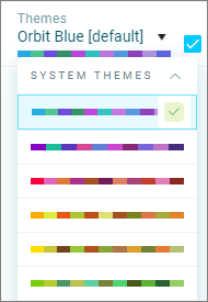
Use the built-in system themes to differentiate the categories, or create your own theme.
Dimensions and measures
Multi dimension charts can have a mix of dimensions and measures depending on the chart type.
See Tile types for more information and the types of charts available.
As you select a chart type, the tile editor will display the appropriate number of dimensions and measures, this also works the other way to filter the charts available depending on what you select.
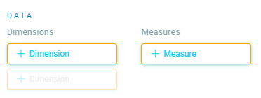
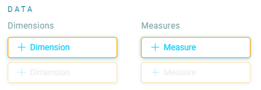
For example if you complete the data selections above, you will no longer be able to select a single dimension chart.
Note
You can delete data options to choose single dimension charts
Adding a visualisation to your dashboard
-
Click the plus
 Add Item icon to open the Tile Editor.
Tip
You can move the Visualisations panel from right to left by clicking the
 icon.
icon. -
Click and select a visualisation type.
-
Enter a Title.
The fields in the panel will adjust to match the tile selected. For example, to display Total Bookings in the Teal Green Holidays demo system using a Number Card:
-
Click + Measure to access and then Search data… or Browse data.
Tip
To identify the total number of records in a table, use the Search option and type the table name – for example, in our demo system, this might be Bookings…People…Communications. You cannot select table items using Browse.
Multiple colours
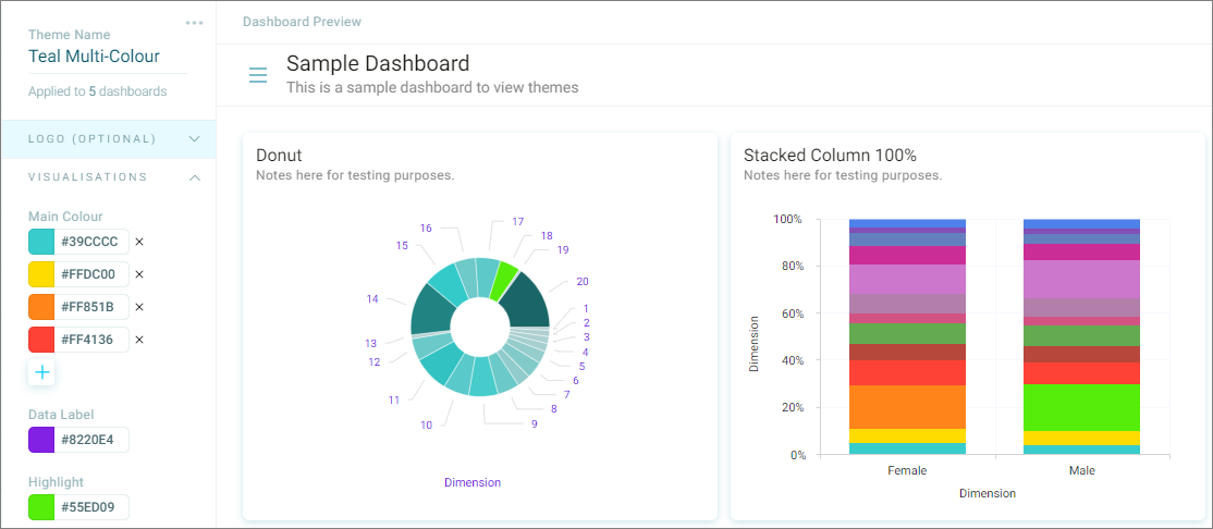
More than one visualisation colour can be applied to a dashboard theme.
These help differentiate the categories on a dashboard.
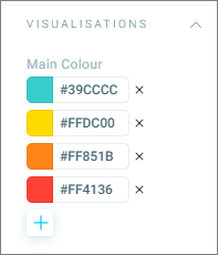
- Click the + sign to select additional colours
Note
You will need to experiment with the choice of colours to ensure the Highlight colour stands out
Function options available
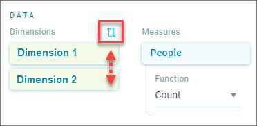
- Use the Swap order of dimensions switch to swap which dimension is used for the vertical grouping.
Note
If you have selected Allow category display with a limit, the limit will apply to the first dimension. You may need to adjust the limit
Legend
- Select the Show legend option to show the legend.
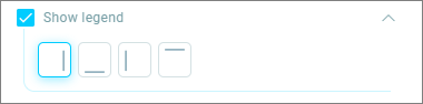
- Click the icon to position the legend
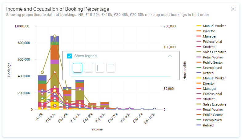
Chart types
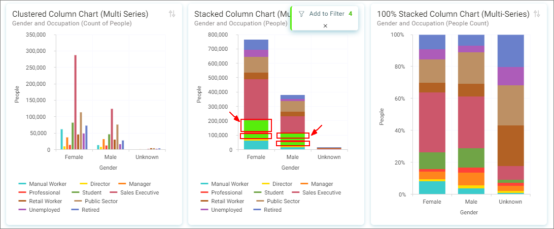
Clustered column
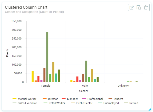
A clustered column chart displays two dimensions and one measure to compare multiple categories. The vertical axis displays the measure.
- Dimensions - Gender and Occupation
- Measure - People
Stacked column
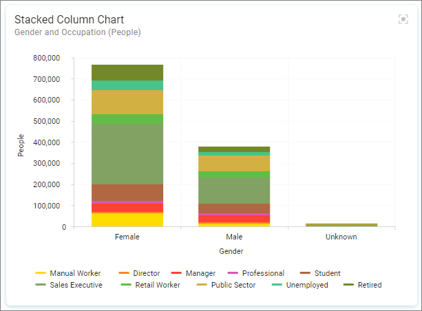
A stacked column chart displays two dimensions and one measure to compare multiple categories. The vertical axis displays the measure.
- Dimensions - Gender and Occupation
- Measure - People
100% stacked column
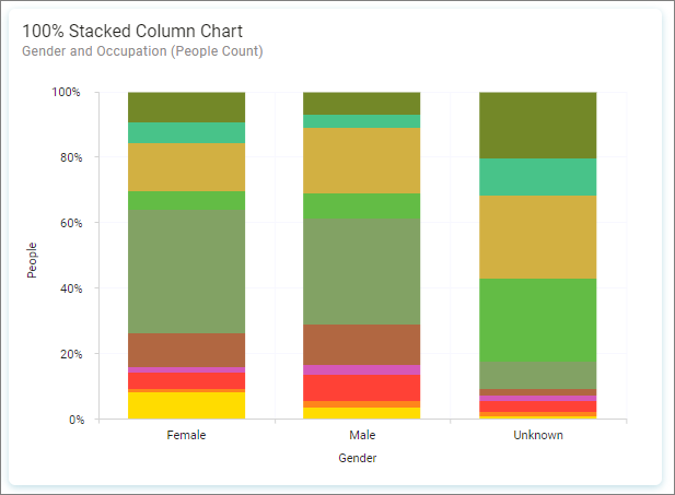
A 100% stacked column chart displays two dimensions and one measure to compare multiple categories. The vertical axis displays the measure.
- Dimensions - Gender and Occupation
- Measure - People
Clustered bar
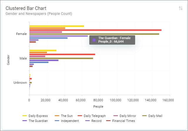
A clustered bar chart displays two dimensions and one measure to compare multiple categories. The horizontal axis displays the measure.
- Dimensions - Gender and Newspapers
- Measure - People
Stacked bar
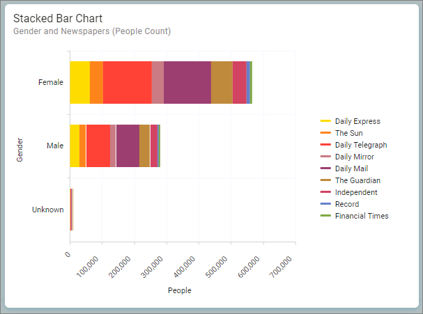
A stacked bar chart displays two dimensions and one measure to compare multiple categories. The horizontal axis displays the measure.
- Dimensions - Gender and Newspapers
- Measure - People
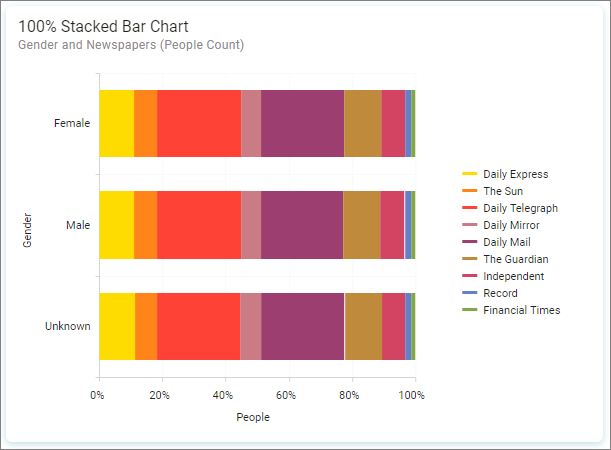
100% stacked bar
A 100% stacked bar chart displays two dimensions and one measure to compare multiple categories. The horizontal axis displays the measure.
- Dimensions - Gender and Newspapers
- Measure - People
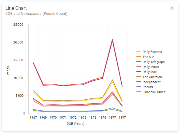
Clustered line
A clustered line chart displays two dimensions and one measure to compare multiple categories. The vertical axis displays the measure.
- Dimensions - DOB and Newspapers
- Measure - People
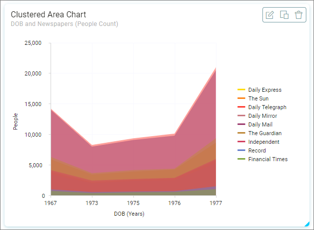
Clustered area
A clustered area chart displays two dimensions and one measure to compare multiple categories. The vertical axis displays the measure.
- Dimensions - DOB and Newspapers
- Measure - People
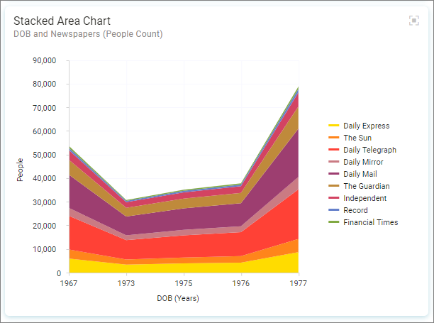
Stacked area
A stacked area chart displays two dimensions and one measure to compare multiple categories. The vertical axis displays the measure.
- Dimensions - DOB and Newspapers
- Measure - People
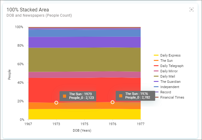
100% stacked area
A 100% stacked area chart displays two dimensions and one measure to compare multiple categories. The vertical axis displays the measure.
- Dimensions - DOB and Newspapers
- Measure - People
Clustered combo
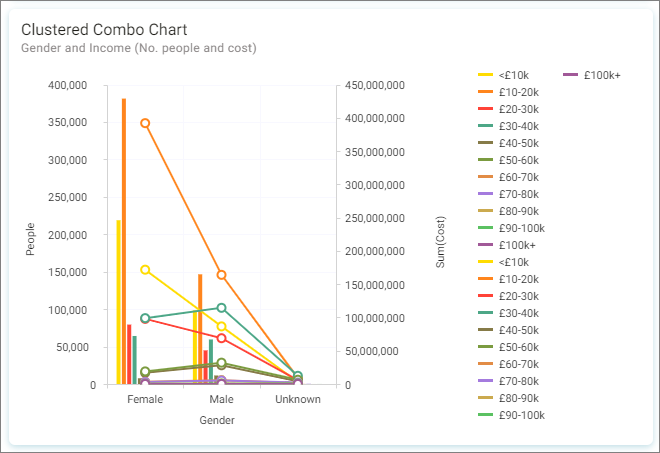
A clustered combo chart displays two dimensions and two measures to compare multiple categories. The left vertical axis displays the first measure, the right vertical axis displays the second measure value range which is represented by a line for each dimension two band.
- Dimensions - Gender and Income
- Measures - People and Cost of Bookings
Stacked combo
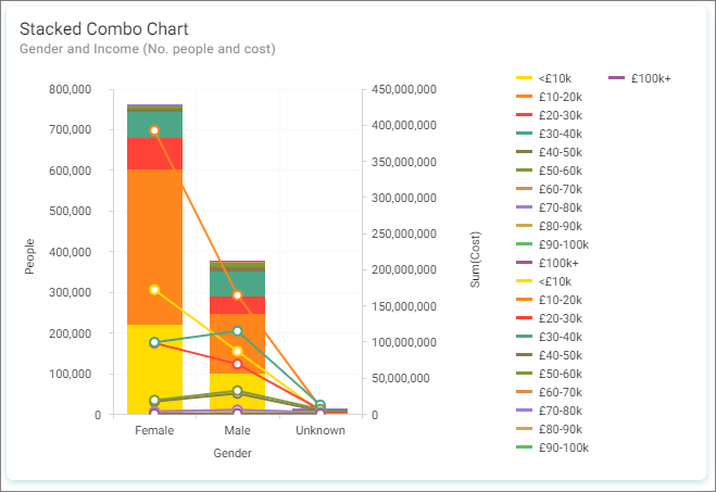
A stacked combo chart displays two dimensions and two measures to compare multiple categories. The left vertical axis displays the first measure, the right vertical axis displays the second measure value range which is represented by a line for each dimension two band.
- Dimensions - Gender and Income
- Measures - People and Cost of Bookings
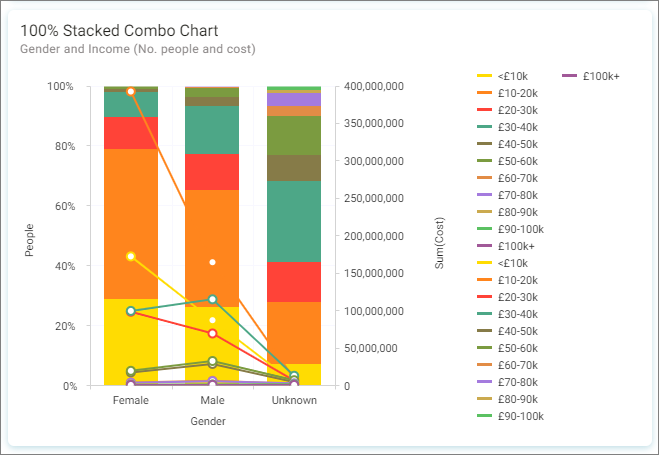
100% stacked combo
A 100% stacked combo chart displays two dimensions and two measures to compare multiple categories. The left vertical axis displays the first measure, the right vertical axis displays the second measure value range which is represented by a line for each dimension two band.
- Dimensions - Gender and Income
- Measures - People and Cost of Bookings