Solutions
Pareto

Banded Pareto
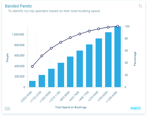
Identify your best-performing customers grouped by value, see Banded Pareto.
A Category Pareto chart displays one dimension in vertical bars banded by the category and combines another layer of data using a line chart.
You can select how many bands are displayed.
Categorical Pareto
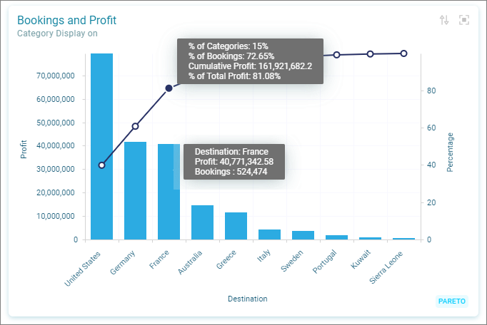
Identify your best-performing products based on their value, see Category Pareto.
A Category Pareto chart displays one dimension in vertical bars banded by the category and combines another layer of data using a line chart.
The line shows the cumulative percentage of multiple data series and other percentage values for each bar, where the total (cumulative) of all the stacked bars always equals 100%.
The right vertical axis displays the second layer value range which is represented by a line for each dimension two band.
Example - Bookings and Profit