Venn diagrams
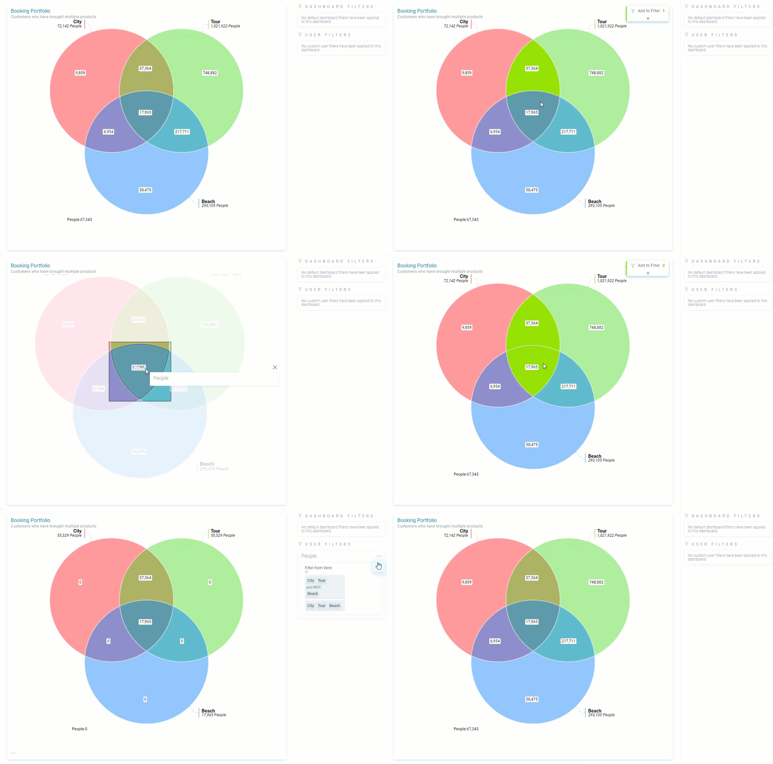
A Venn diagram gives a colourful, graphical representation of how data interrelates. It is advantageous in segmenting the data, for example, when creating target groups for mailings. You can use the Venn to select and analyse your chosen dataset, and then filter a dashboard.
Click on a subset count to zoom in and see a tooltip with details.
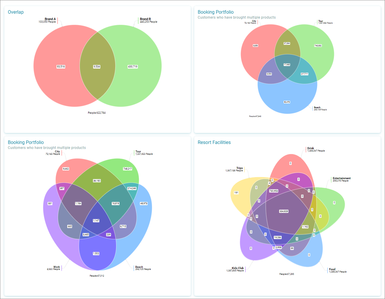
Up to five sets can be used in a Venn diagram. A coloured ellipse representing each set is shown in a different colour. Five default colours are used, however, you can change the colour for each set.
You can add up to five sets.
See Venn diagrams for more information.