Pareto charts
Pareto is an analytical decision making tool based on the 80/20 rule. The Pareto principle revolves around the fact that 80% of a task can be completed by completing 20% of the work, or that 80% of problems to fix are caused by 20% of underlying issues. In Marketing we can use this theory to consider that 20% of the customer communications could lead to 80% of the desired response, or that 20% of your product portfolio could yield 80% of a sales target.
Note
Pareto Prerequisite: To use the Pareto Solution in Orbit, your FastStats system must be running the Q2-2020 release or later
A Pareto chart contains a column chart and a line graph. The column chart shows our values in descending order to identify the best sellers or the best buyers. The line graph shows the cumulative percentage, or rolling total as a percentage to enable you to easily identify percentage thresholds.
Orbit includes two types of Pareto analysis - a Category level and an Banded Pareto - enabling you to answer questions such as: Which are the top product categories that equate to 80% of my sales, or Who are the top 20% of my spenders?
Category pareto
The Category Pareto allows you focus on mainly transactional data to identify, for example top selling product categories or most popular booking destinations. By defining a Category variable and a numeric variable, the resultant Pareto chart will sort descending by category based on the numeric value defined. The line chart will then show you a cumulative percentage total based on your numeric value so that you can quickly select those categories which bring you most success. You can then add these to a User Filter or create an Audience.
Tip
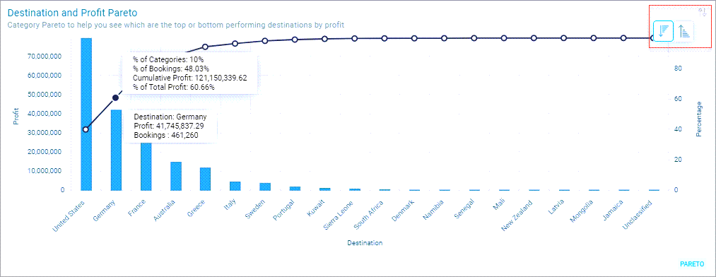
Tooltips display the discrete and cumulative number of records in each category, the cumulative proportion of all records and cumulative proportion of all categories.
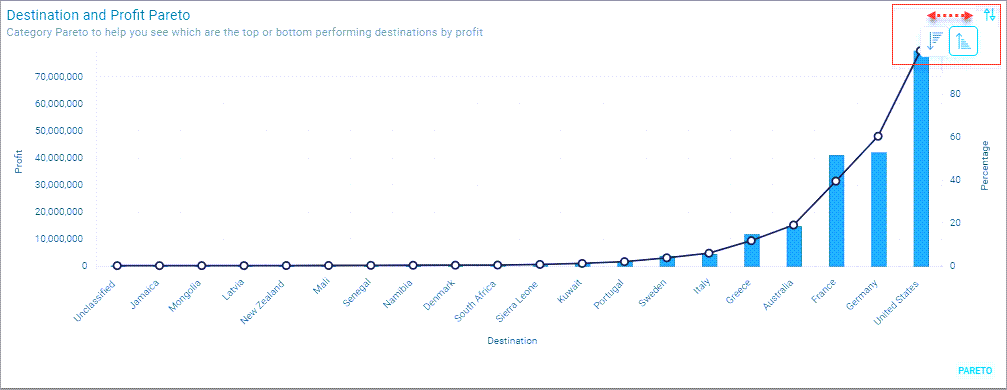
- You can select between an Ascending or Descending view
Note
The Pareto chart shows whatever ratio occurs in the data, not necessarily 80/20
Setting up a category pareto tile
- From the Solution Tile Tab, select the Category Level Pareto icon to reveal the data input options for this tile.
Note
Only one Pareto tile can be added to a Dashboard
- In this example, we are going to determine which destinations yield around 80% of our profit. To populate the Category, and Value, click on the associated menus.
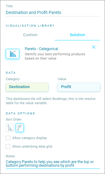
- For Category, click on the Category + option to search or browse data within your Apteco database. Choose a categorical data variable such as Destination or a Product Category. The filter will only show you variables which can be used for this option
-
The Value field is used to order the destinations in descending order to show you the "Best" category down to the worst category.
-
This is a numeric value - for example, sales, profit or the number of complaints. In our case, we are selecting Profit, also from the Bookings table, to sort our Destinations in descending order
Tip
Use the Sort Order to set the initial view as Ascending or Descending, you can also change this on the dashboard Pareto Chart
Tip
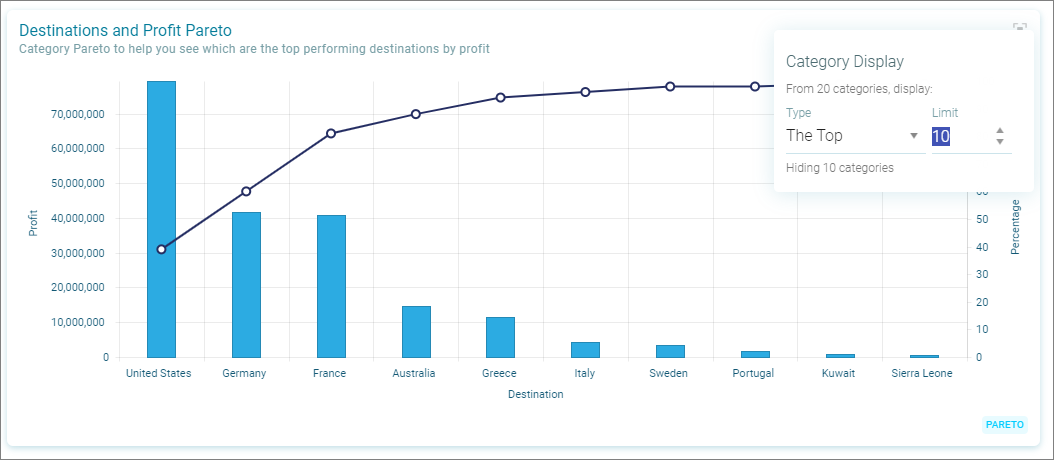
If the Category field has a large number of options you can use Category Display to limit the number, for example the top 20
- To be able to see the underlying data records, select the option to "Show underlying data grid"
-
If you wish for any notes to appear under the chart title, they can be added to the Notes section in this tab
-
Once completed, click Apply
The Pareto tile will now be applied to the Dashboard. By choosing Save, the Pareto tile along with the Dashboard will become interactive.
Category display option
When Allow category display has been selected and the Dashboard Creator has selected the Allow the user to adjust this display option, you can increase the number of categories or choose to display the Top % of categories by their value.
Note
Categorical Pareto currently supports Top N Category Display. The ability to choose the Bottom N Categories will be available in subsequent releases.
Banded pareto
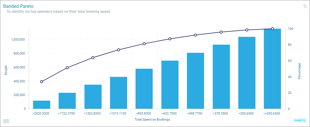
The Banded Pareto allows you to focus on identifying your top customers based on a numeric variable. You can use this option of Pareto to understand, for example your top spenders based on a revenue variable, or your top complainers based on a number of complaints variable. Again, the rolling total percentage will allow you to select the percentage of people you wish to focus on by allowing you to add to a Dashboard Filter or even create an Audience.
Setting up a banded pareto tile
From the Solution Tile tab, select the Pareto -Banded icon to reveal the data input options for this tile.
In this example, we are going to identify our top spenders based on a system variable called Total Spend of Bookings.
- To populate the Value and Number of Bands click on the associated menus:
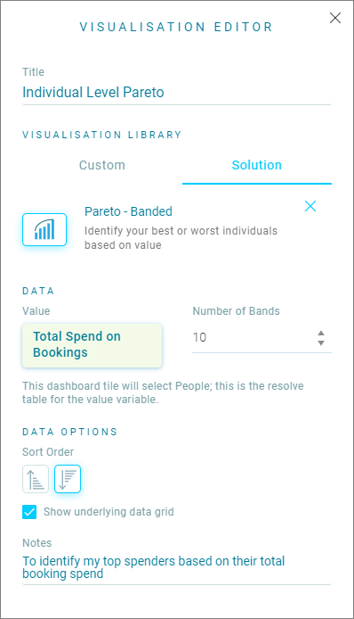
Orbit will use the Value variable to calculate spend bands where there are equal numbers of people in each band. To have 10 bands means that it will allocate 10% of your individuals into a band according to how much they spent on bookings.
Note
Use the Sort Order to set the initial view as Ascending or Descending, you can also change this on the dashboard Pareto Chart
In our case, we are looking at top spenders so we shall sort descending.
-
Select the Show in underlying data grid option If you wish the users of the dashboard to see the underlying data.
-
Once you have filled out the details in the Visualisation Editor click Apply.
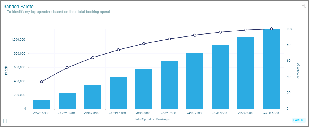
The chart will show the 10 bands specified, and a cumulative percentage of people.
Tip
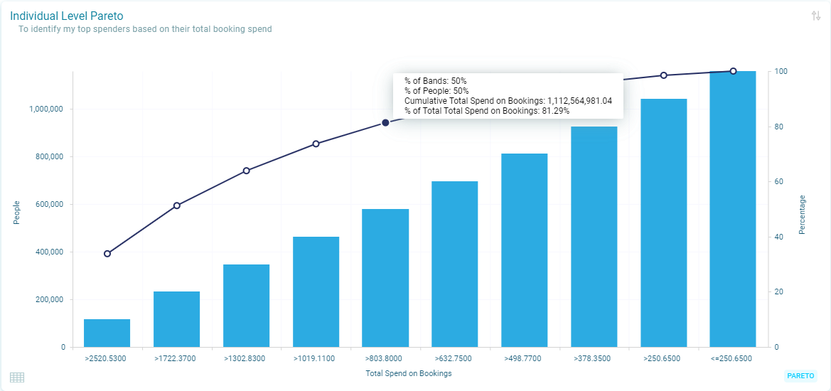
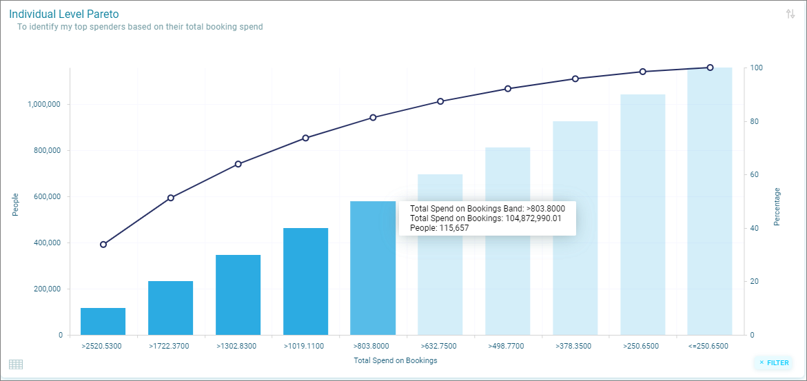
You can use the tooltips to see extra information regarding the spend on bookings, the count of people and the cumulative spend.
By hovering over a point on the line, details will be shown, for example the % of Bands chosen and the % of People selected. It also shows you the cumulative spend and the total percentage of spend that this equates too.
- By hovering over a bar on the chart, details will be shown for example, the spend band of the bar, the number of people selected in that bar and the total spend of bookings in the bar.
- If I wanted to select 50% of my Top Spending customers, I could use the tooltip to select the bars required to achieve this. Select the Line or the bar, to select all bars the left of it.
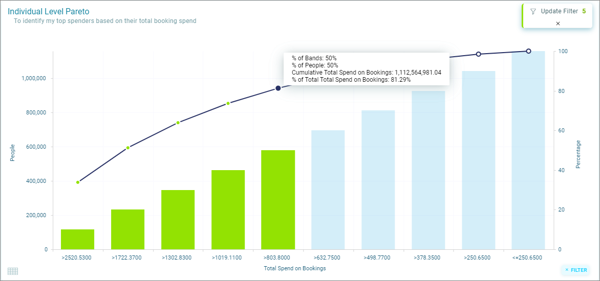
- By selecting the bars, they will change colour and an Add to Filter button will appear in the right-hand side of the chart. Clicking this will allow the selection to be added as a User Filter to the dashboard.
Tip
The filter added will appear in the User Filter as a Top N. Rather than selecting static spend bands, a Pareto User Filter will always select the TopN (50% in this example) of Top Spenders to cater for the recalculation of the spend bands for the People selected. This will be beneficial when creating dynamic Audiences to use in analysis or campaigning where the requirement is to always select the TopN spenders.
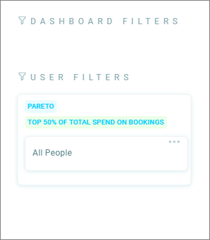
Updating the filter
The Pareto solution allows you to explore the Top Spenders selected. If further Individuals are required. select the additional spend bands and choose Update Filter to add them to the User Filter.
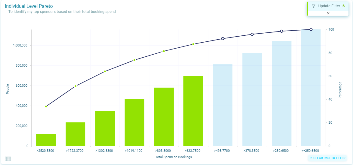
- To clear a Pareto Filter, select the Clear Pareto Filter option on the chart or delete the filter from Dashboard Filters.
Sorting the pareto chart
When creating the Pareto Chart, a descending sort option was chosen to ensure we could see Top Spenders. You can change this in the dashboard to sort the chart ascending if required.
- Click on the sort icon on the top right of the chart to change the way the data is ordered.
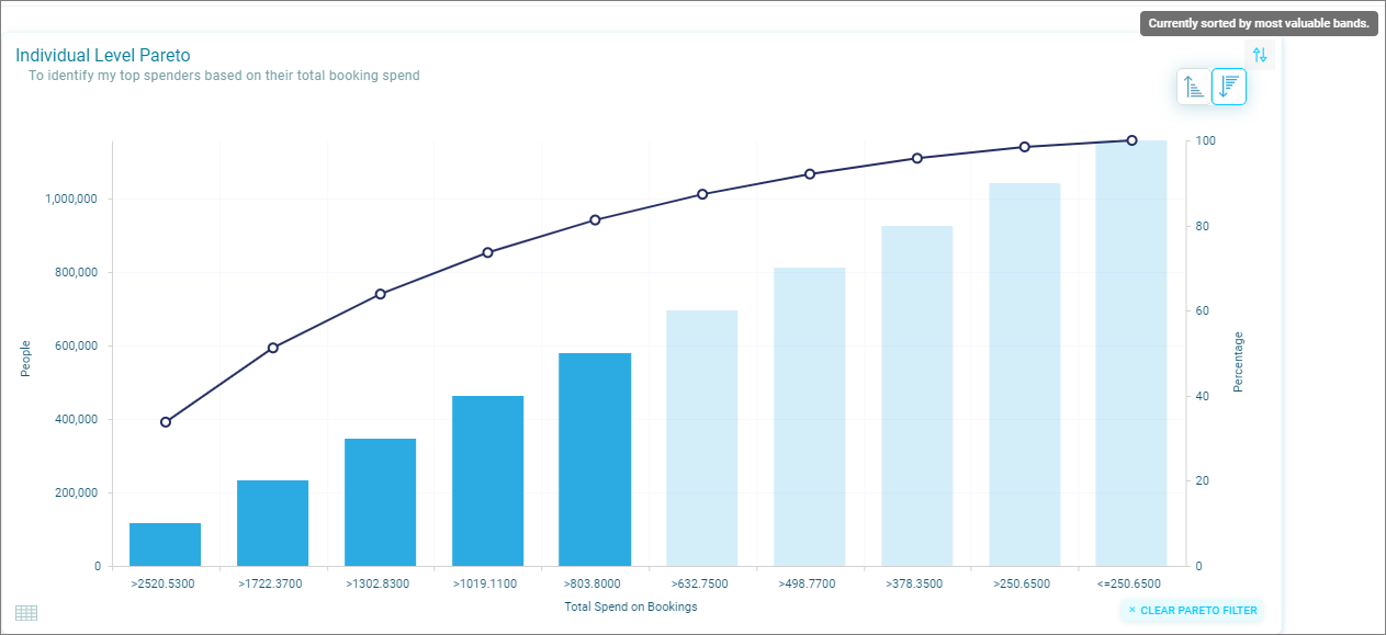
Using pareto to filter the dashboard
As well as applying the selected bands as User Filters, any selected bands will also affect the display of data in the surrounding tiles. This will allow you to add other tiles to understand the Top Spenders such as what destinations they are frequenting, where do they live, their length of relationship with the brand or even their income to name but a few attributes which could be used to paint a picture of who they are.
The Pareto chart can then be updated to increase or decrease the spend bands or the cumulative percentage of individuals selected so that patterns in the data can be explored.
Note
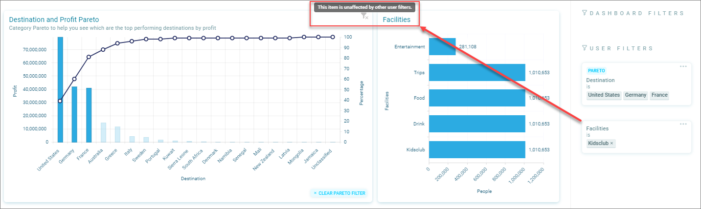
If User Filters are added from other tiles on the Dashboard, all tiles but the Pareto tile will be affected. The Pareto tile will remain in its original state, showing the Individuals and their Total Spend based on the Dashboard Filter only.
Creating an audience from a banded pareto
Once a Pareto Filter has been applied as a User Filter, this filter can also be added to an Audience for practical application. Click on the +Audience icon in the dashboard.
Note
The filter applied from Individual Pareto will be a TOPN function. This means that the Audience created will always reflect the Top or Bottom % of People selected rather than static spend bands.
Worked example
Using transactional attributes on a person level dashboard
Due to the hierarchical nature of the Apteco software, one person can have many bookings and those bookings can have many attributes etc. This provides for powerful data models, but means you need to be clear of the definition and dashboard results when working across tables.
This example will illustrate this using Booking level information on a Banded Pareto tile on a Person dashboard
- On a Dashboard built at a Person level, a Banded Pareto has been set up with 10 bands of the Profit field from the Booking table (i.e. transactional level).
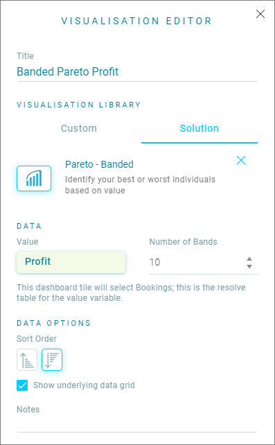
Note
The Banded Pareto does not aggregate the Profit to a Person level. It looks at the bookings as separate records and creates 10 bands with equal numbers of Booking records (deciles) based on the Profit of each booking. Therefore, one person who has made a more profitable booking and has also made a less profitable booking will have bookings present in both Profit bands. Note that the Banded Pareto edit panel confirms that the tile will select (and therefore show) Bookings.
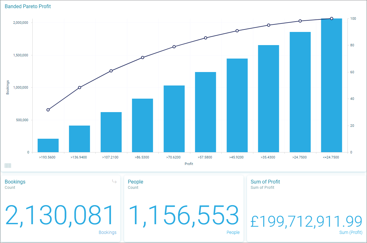
- In this example, number tiles have been added to the Dashboard to explain the calculations. Initially, the Bookings tile shows the total number of bookings made by all the People included in the Dashboard filter. The People tile shows how many people the dashboard filter has selected and the Sum of Profit tile shows the total value of all bookings made by these individuals.
When we apply filters from Banded Pareto, the numbers will change but in a manner that is different from the totals on the tooltip.
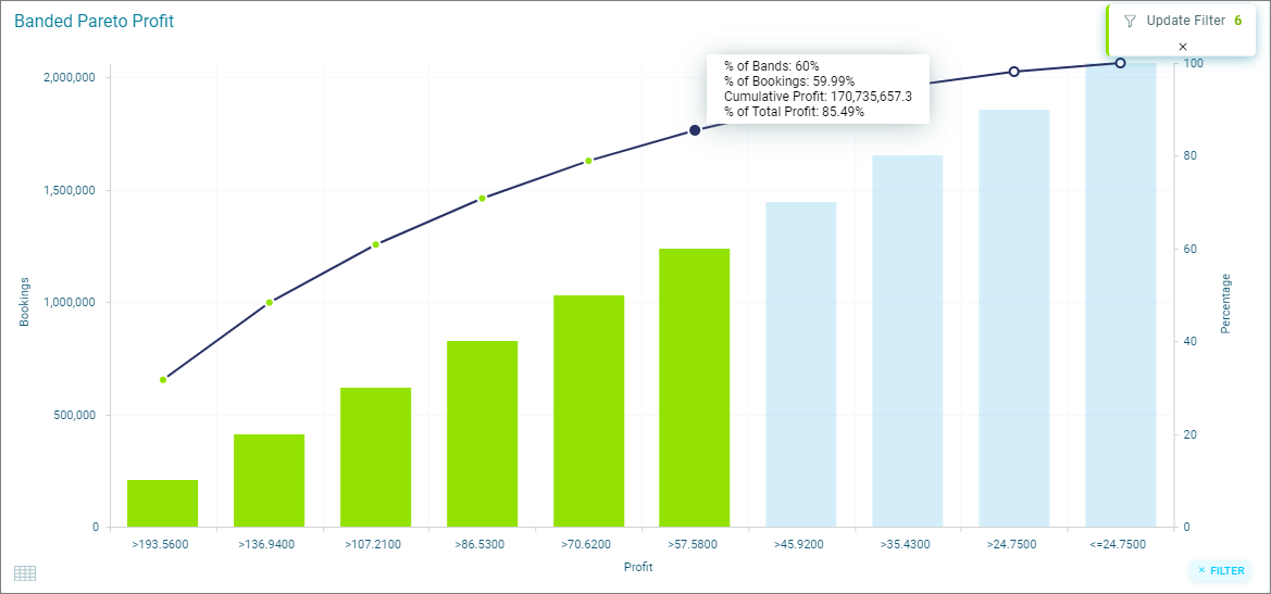
- Note from the tooltip that for the top 60% of the Bookings (the highlighted bars), there is a Cumulative Profit of £170,735,657. When applied as a Pareto Filter on the dashboard, the surrounding tiles will update to reflect the selection made by reference to the People who made the 60% most profitable bookings.
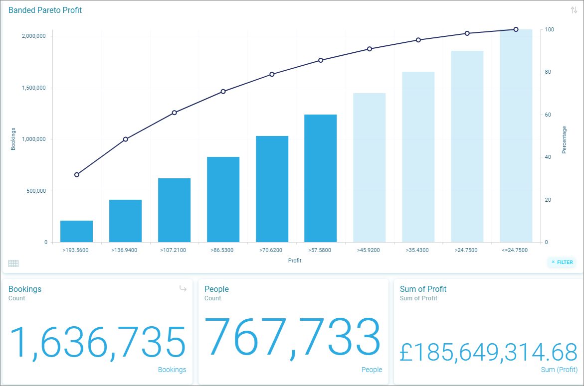
- The 60% of the most profitable bookings have been selected in Banded Pareto. However, as the dashboard is built at a Person level, adding the filter, means the Dashboard is now filtering to the 767,733 people who have made the 60% most profitable bookings. These individuals have made other bookings which fall outside those most profitable ones. In fact, they have made 1,636,735 bookings in total and brought in a profit of £185,649,314. The difference between this figure and that shown on the tooltip is the £14,913,657 profit from additional (lower profit) bookings made outside the profitable ones selected in the Banded Pareto tile.
Note
In many cases it is appropriate to use Dashboards resolved to People so you can get a rounded view of all activity. However, if you solely wish to analyse particular transactions, we recommend the dashboard is built at a transactional level to avoid additional transactions belonging to the Person being included. Alternatively, where, for example, the total profit for a person is required, the Banded Pareto tile can use Person level variables to ensure that the Person is selected because of the aggregated Profit that individual has yielded over time rather than looking at the profit of each booking.
Solution tiles
Where to find it
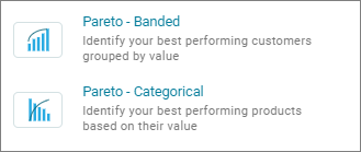
To add either Pareto tile to a Dashboard, firstly put the Dashboard in Edit mode, add a tile. From here navigate to the Solution tab in the Visualisation Library and select which Pareto type you wish to use.
Using the pareto chart
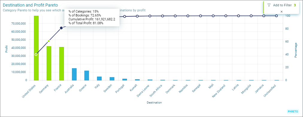
In this example destinations are sorted descending by profit and a cumulative percentage of profit has been added as a secondary axis - we can see that our most profitable destinations are the United States, Germany and France.
Using pareto as a filter
Clicking on any column will auto-select all the higher value categories to the left, allowing you to apply them to a User Filter to filter the Dashboard, or use that filter to then go ahead and Create Audience.
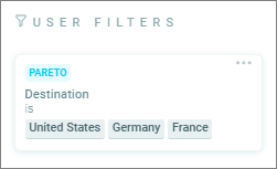
Here the secondary axis has been selected to find 80% of profit. By selecting the node on the secondary axis, United States, Germany and France are highlighted sand you can now apply them to your User Filter.
- Clicking Add to filter will apply a filter to the whole Dashboard.
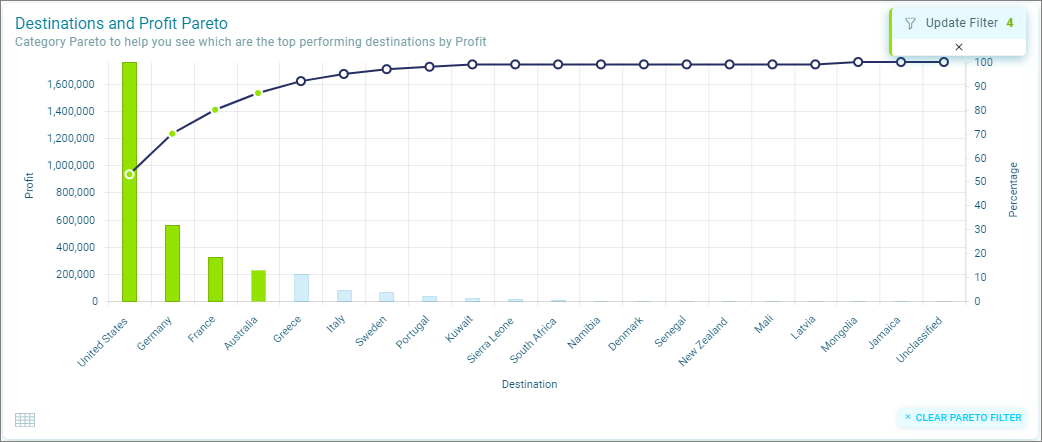
You can add or remove categories as required. Select or deselect the categories and choose Update Filter to apply the updated categories to the User Filter.
- Pareto filters are shown in a separate PARETO filter section if you have added any other filters, you can Delete just the Pareto filters using the delete icon
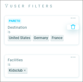
- To clear a Pareto filter, select the Clear Pareto Filter option on the chart or delete the filter from User Filters
Note
When categories have been applied to a Filter, the Filter will name the Categories selected. If data changes and these categories are no longer the top performing, the filter will need to be updated by selecting the categories again. Where an Audience has been saved using the Pareto filter, the data will not currently update automatically.
Understanding pareto filters
As well as applying the selected categories as User Filters, any selected categories will also affect the display of data in the surrounding tiles. This will allow you to add other tiles to understand, for example, the profit acquired from these destinations, the seasonality of the sales of products, the best selling regions that make up a percentage of your profit or the type of holiday which is most frequently booked for the top performing destinations.
You can update or decrease the percentage value or the number of categories selected, so that patterns in the data can be explored.
Warning
If User Filters are added from other tiles on the Dashboard, all tiles except for the Pareto tile will be affected. The Pareto tile will remain in its original state, showing the value and categories based on the Dashboard Filter only.
View underlying data grid
If the option to Show Underlying Data Grid was selected when the tile was set up in the Visualisation Editor, then a grid icon will be displayed in the bottom left of the tile.