Chart types
The following types of Chart can be displayed:
Column chart (default)
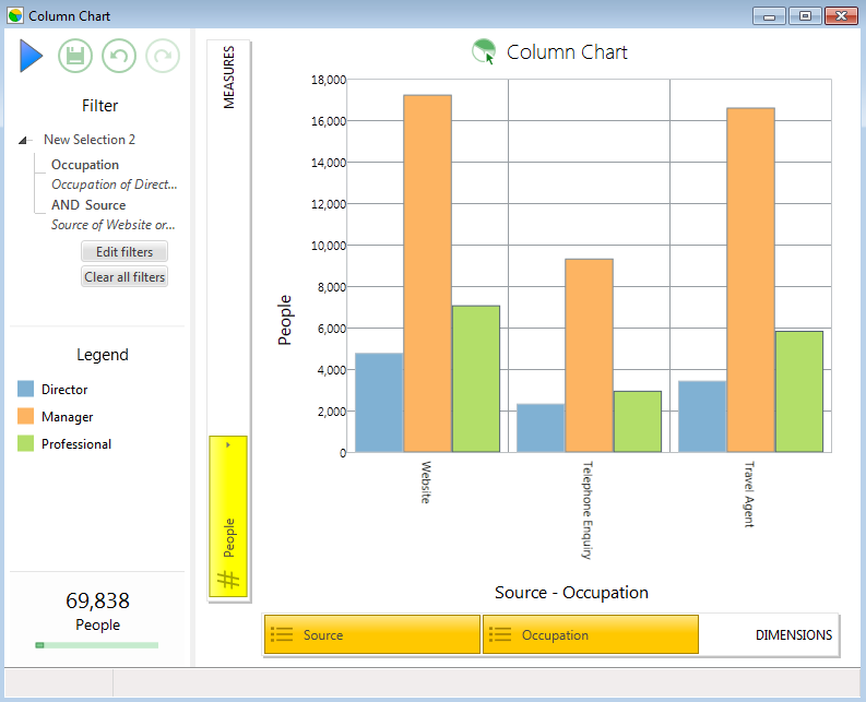
Each cell frequency is represented by a rectangular bar, plotted vertically.
Bar chart
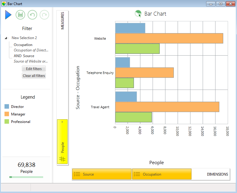
Each cell frequency is represented by a rectangular bar, plotted horizontally.
Point chart
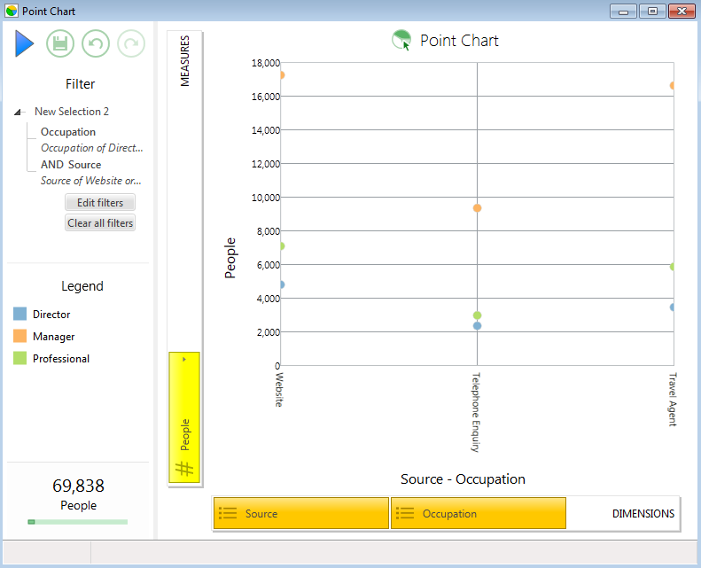
A Point Chart is a variation on a Bar Chart. Instead of representing each cell frequency with a single bar, a single spherical point is plotted to represent the frequency. In other words, the frequency is represented by the height of the point.
Line chart
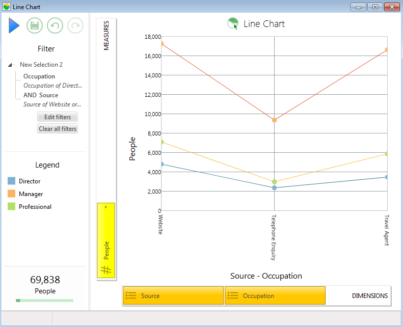
A Line Chart is a variation on a Bar Chart. Instead of representing each cell frequency with a single bar, the line chart uses one continuous coloured line per category.
Pie chart
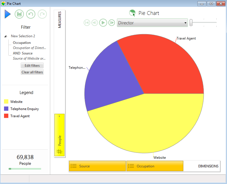
A Pie Chart is a circular graph divided into segments. Each segment represents a particular category and the size of the segment shows the frequency of that category compared to the other categories i.e. larger frequencies have larger sized segments.
Treemap chart
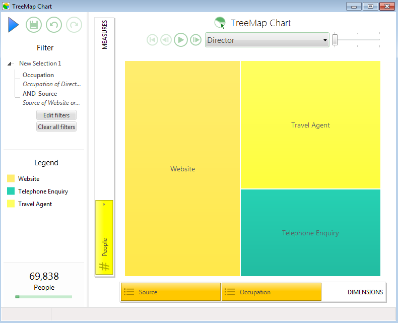
Treemaps display hierarchical (tree-structured) data as a set of nested rectangles. Each branch of the tree is given a rectangle, which is then tiled with smaller rectangles representing sub-branches. A leaf node's rectangle has an area proportional to a specified dimension on the data. Often the leaf nodes are coloured to show a separate dimension of the data.
When the colour and size dimensions are correlated in some way with the tree structure, it is often easier to see patterns that would be difficult to spot in other ways, such as if a certain colour is particularly relevant. This is best achieved by viewing Treemaps in a Trellis Combination.
A second advantage of Treemaps is that, by construction, they make efficient use of space. As a result, they can potentially and legibly display thousands of items on the screen simultaneously.
Multi chart
Multi-measure displays can be generated on a single dimension chart.
.png)
For further information on creating multi-measure chart, see: Create a multi-measure chart